Project overview
Gyloco is an e-commerce platform of interior decor concepts from Belarus. Gathered information about this company, I chose some insights and I created an e-commerce mobile application whose purpose was to help art lovers get ceramic designs made by different artists, in which users could find the latest trends in pottery art. The app provides an artistic experience for people passionate about interior decorated spaces.
Problem statement
Many e-commerce applications have been thought of mostly for gastronomy and retail. However, it isn't common to find applications that pay attention to collectors, art lovers, and artists who want to sell and buy their artwork. Most online pottery sales are not easily visible or promoted, and most promotions occur through marketplaces.
The solution
This app offers valuable insights into sustainable living practices, minimalist design principles, and user experience (UX) design. It promotes environmental awareness, encourages eco-friendly purchasing decisions, and supports local artisans. By exploring this app, the user learn how to integrate sustainability into daily life, appreciate minimalist aesthetics, and understand innovative approaches to technology that prioritize both functionality and environmental responsibility.
My role
UI Designer
Timeline
4 weeks
Tools
Adobe XD, Photoshop and Illustrator
Discovering and defining the project
The process started from three important questions: Who will be the user of this application, What is the purpose of this app, and How will the app help to the user.
Defining the user
The target users for this app are individuals aged 25 to 55 who are passionate about art and eager to buy the latest trends in interior design and decoration. They prefer not to waste time going to shopping centers. Spending most of their time at home due to studies and remote work, they are willing to invest in creating a well-decorated environment in their living space where they spend a significant amount of time.
Information architecture
I envisioned an application with a green consciousness at its core. It's essential to highlight designs with minimalistic layouts, featuring less information and clean white backgrounds. The focus is on reducing emails and supporting works with a sustainable purpose. The app should be intuitive and require fewer clicks to navigate.
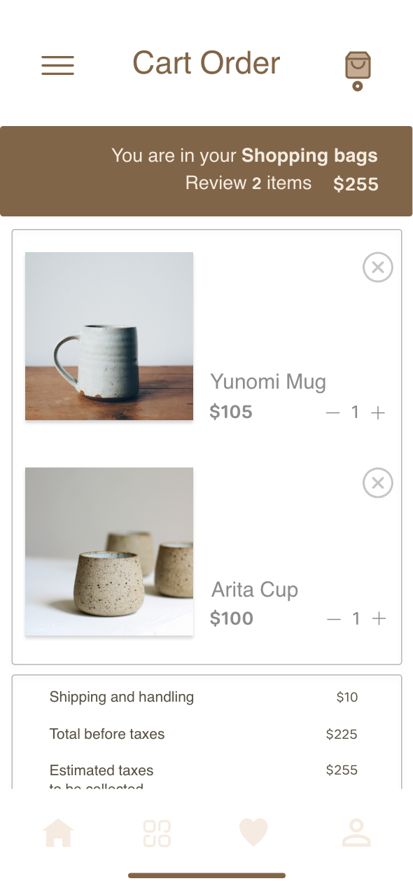
Purchase flow
UI Design Result
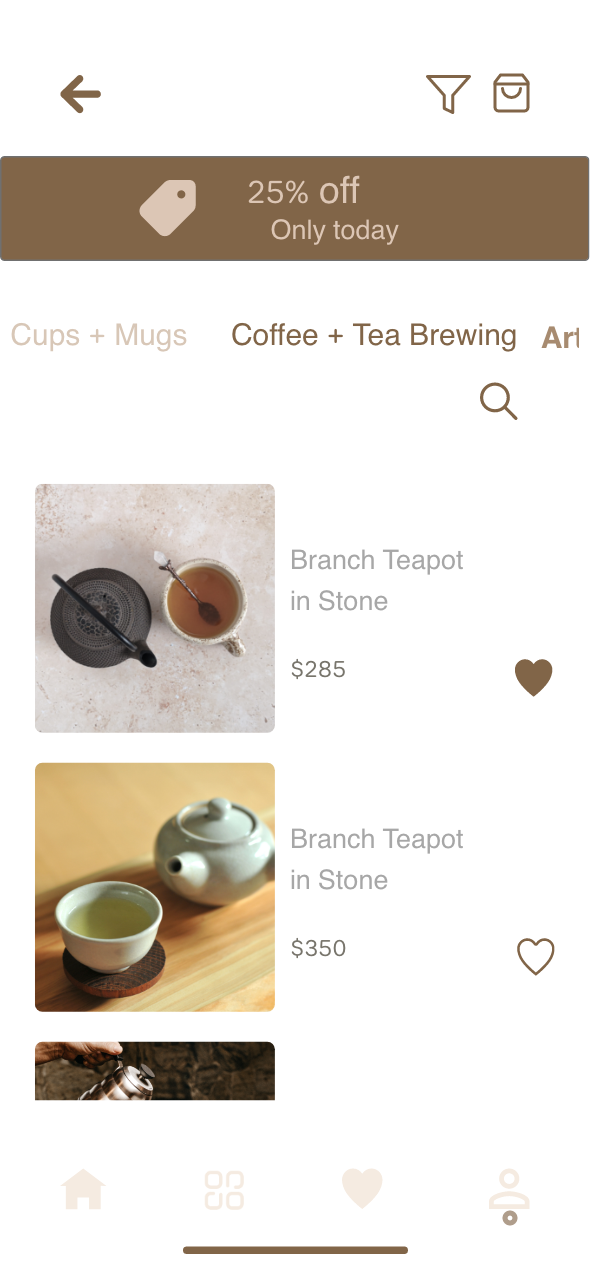
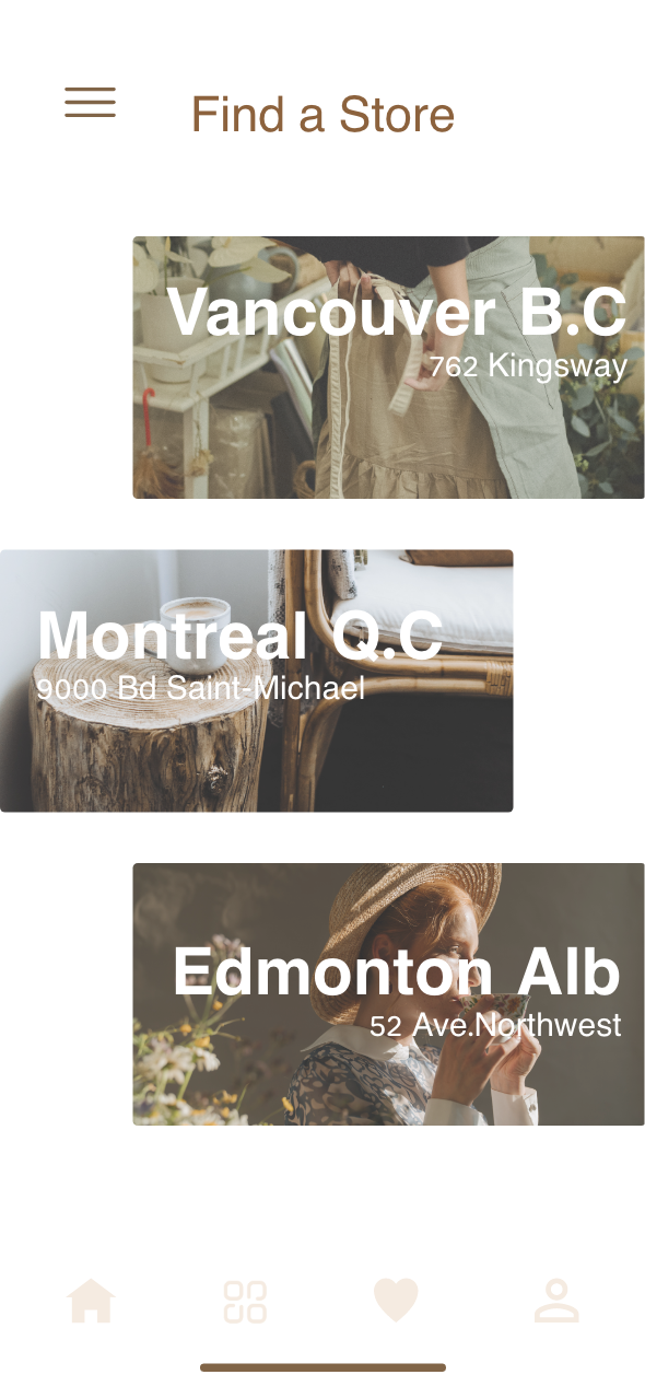
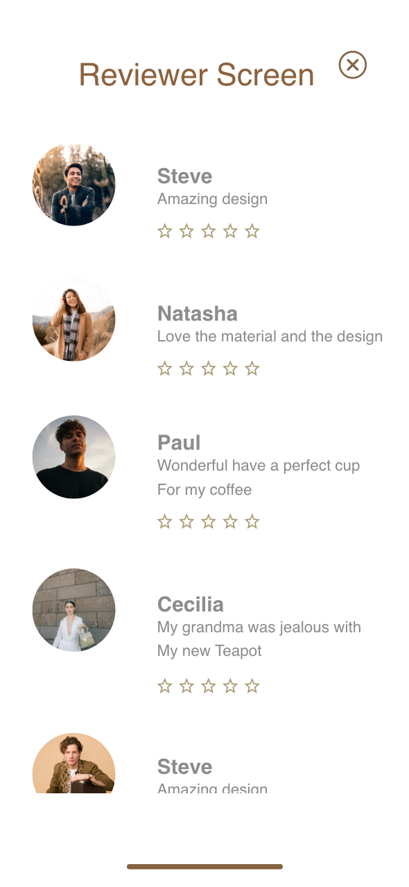
I was inspired by architectural spaces. Imagine a layout characterized by sleek, minimalist design elements, where sunlight dances upon concrete surfaces, casting symmetrical shadows that evoke a sense of harmony and tranquility. The key is to choose the right pages to control the market without overloading the app with images.
Style Guides
The colors were selected based on the primary material from which the ceramic is made: clay. The various coffee tones emerged from the idea of clay being shaped by hands on the potter's lathe. The green color symbolizes nature, while the grey, white, and black colors are part of the neutral tones used for contrast.
The font is an unassuming monolinear typeface with rounded terminals. Its calm and saturated style was chosen to complement the product's curved shapes. The components are minimal, featuring clear microcopy for call-to-action elements and specific icons that illustrate different pages and their content.
Wireframes: Low Fidelity
The low-fidelity wireframes were created to establish the basic structure and layout of the app. These wireframes are simplified sketches that focus on the placement of key elements and the flow between different screens, without delving into detailed design aspects.
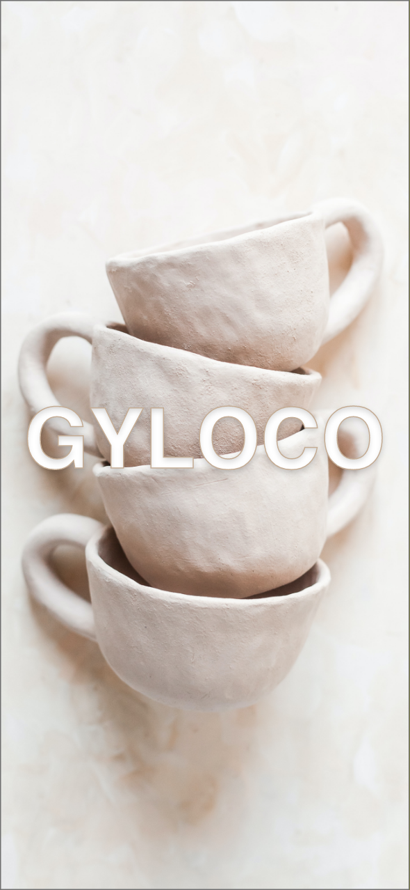
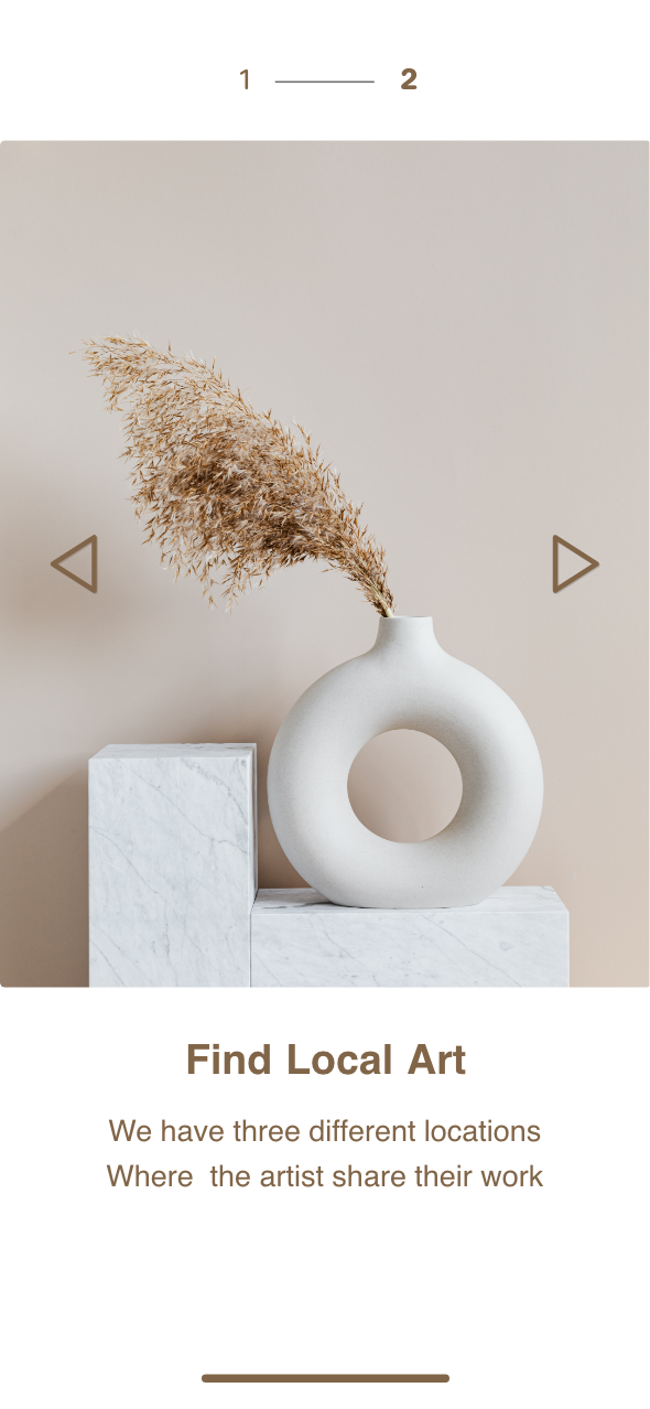
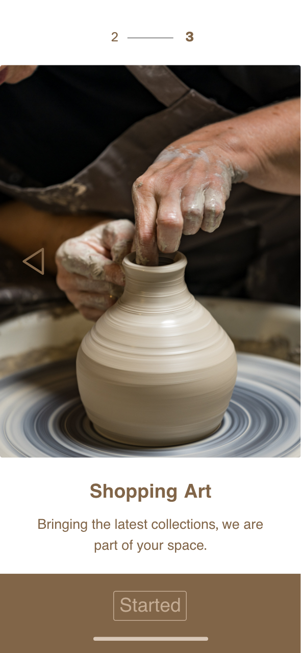
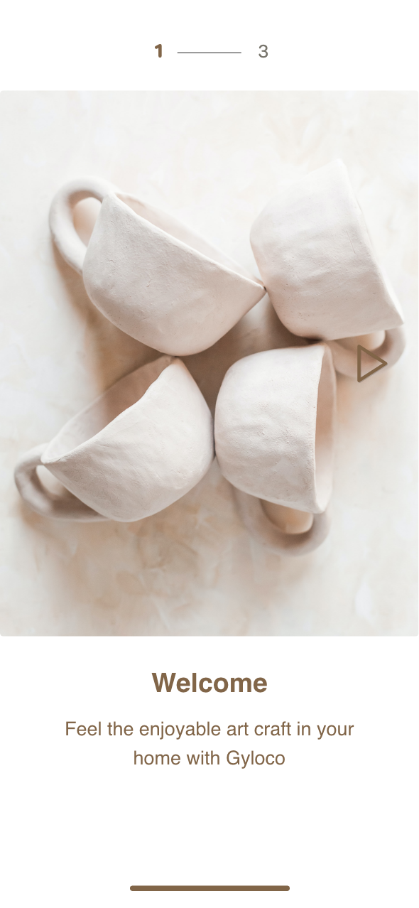
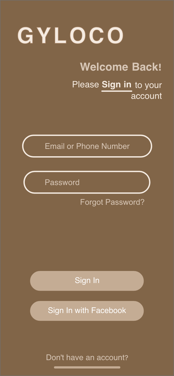
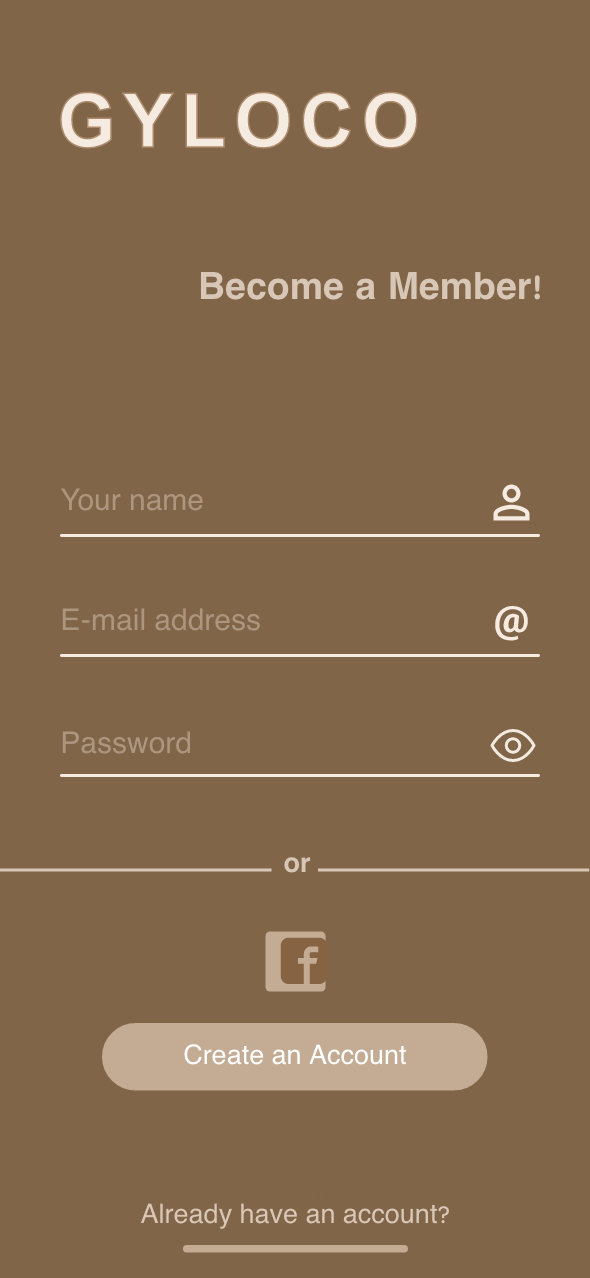
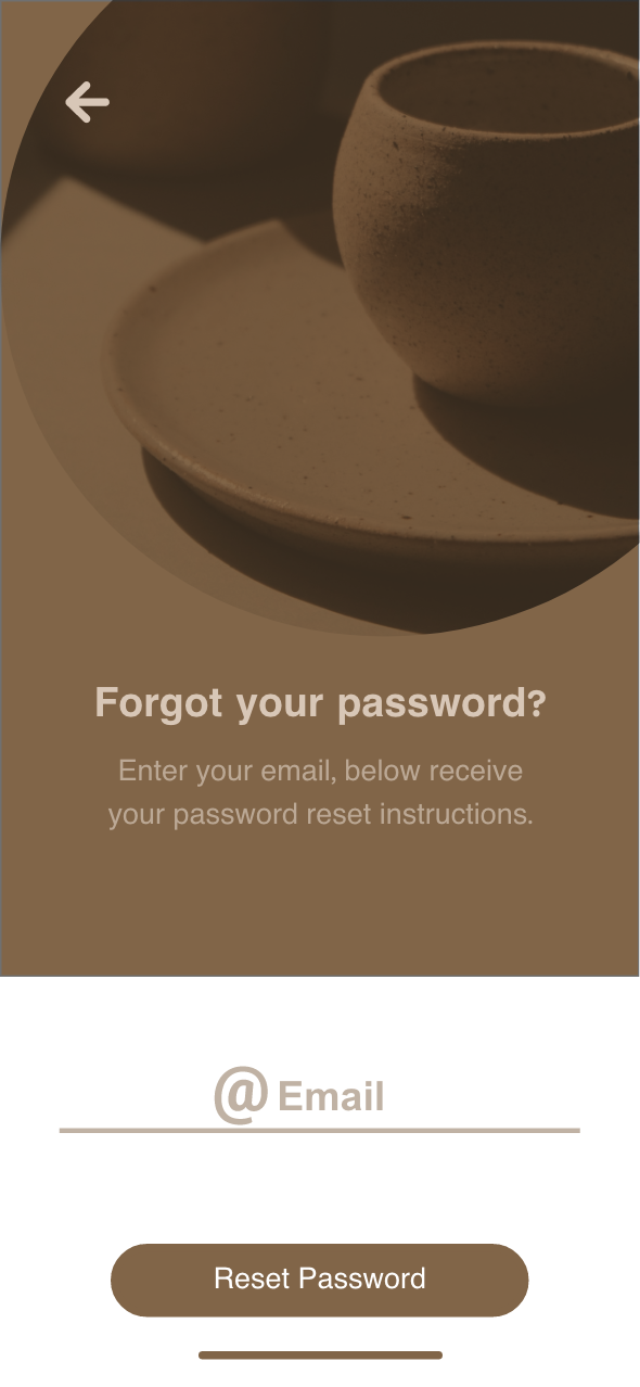
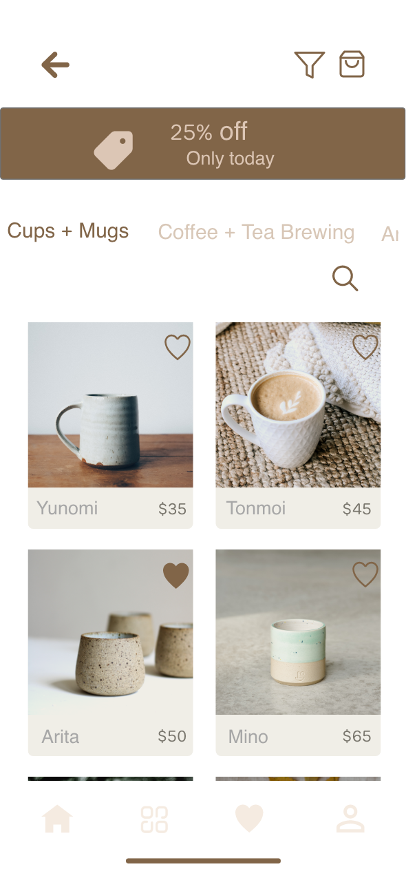
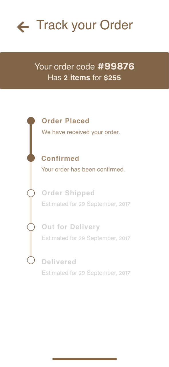
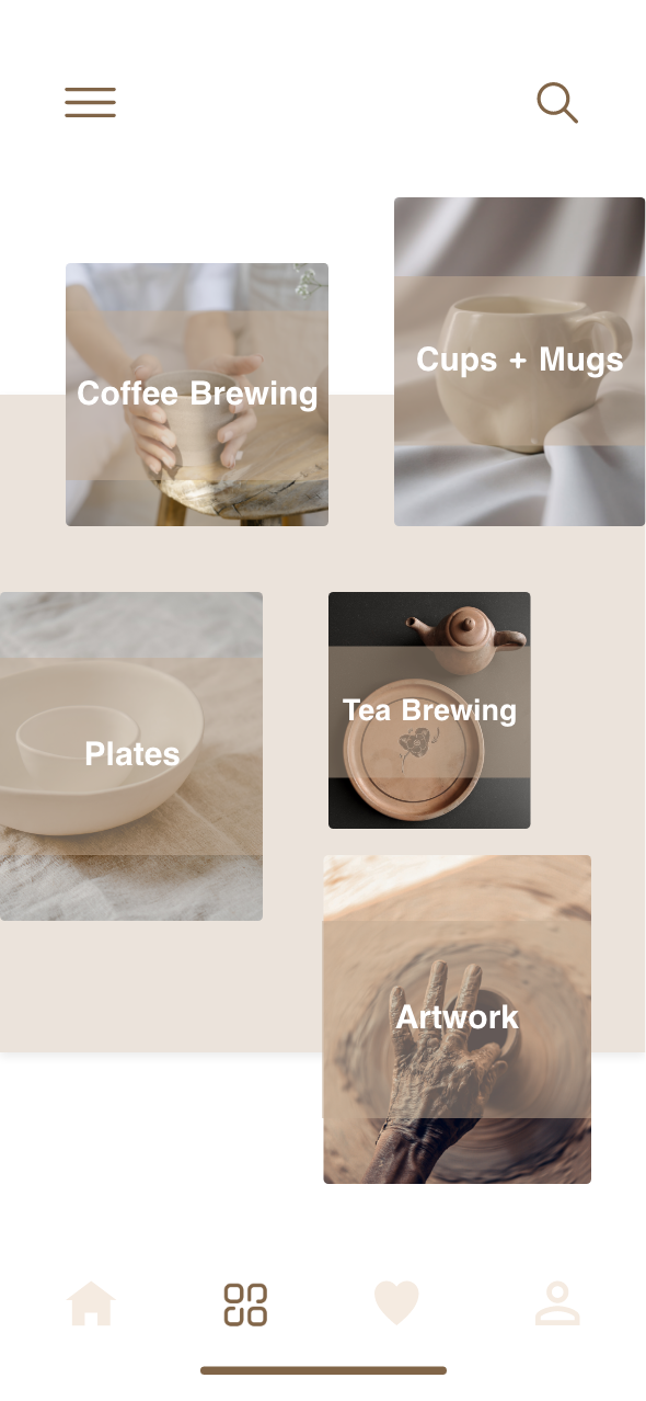
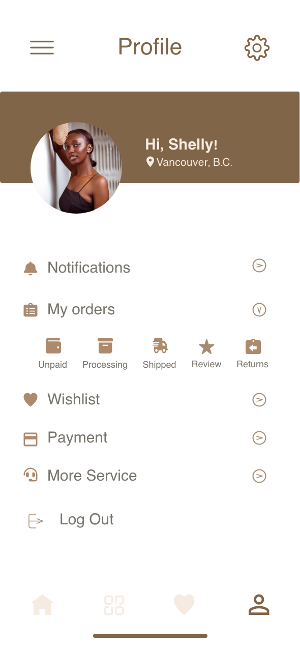
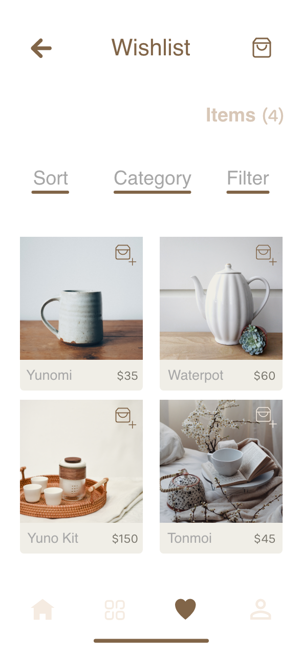
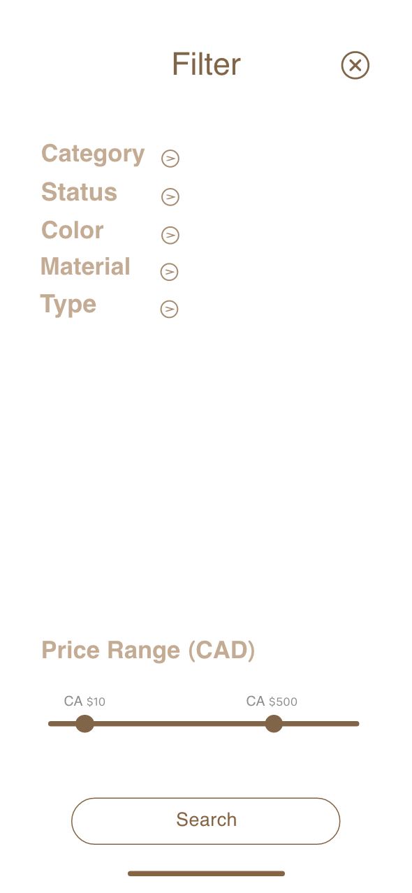
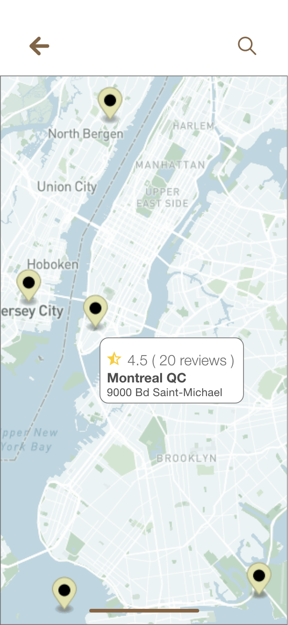
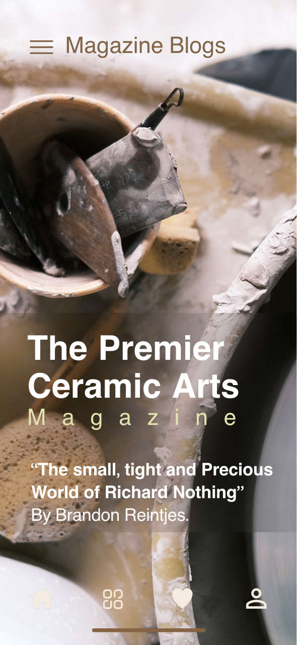
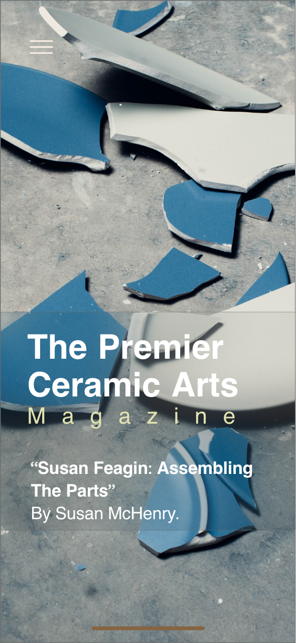
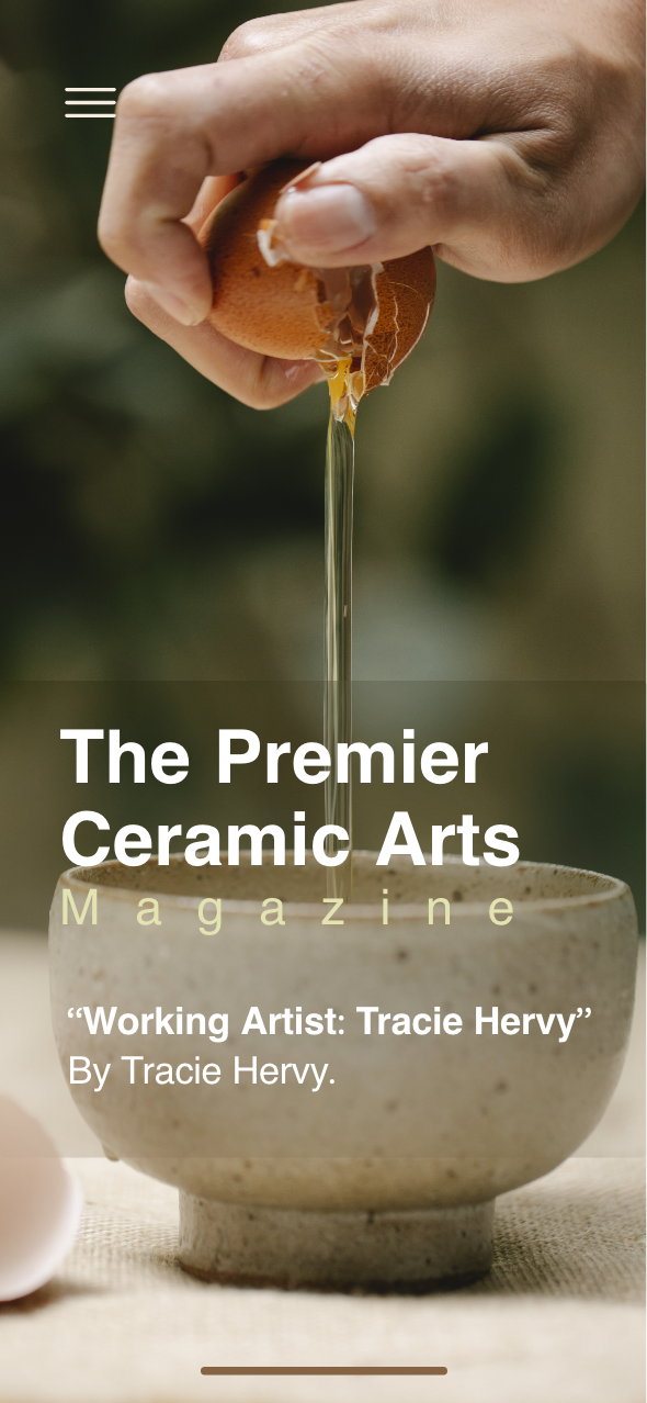
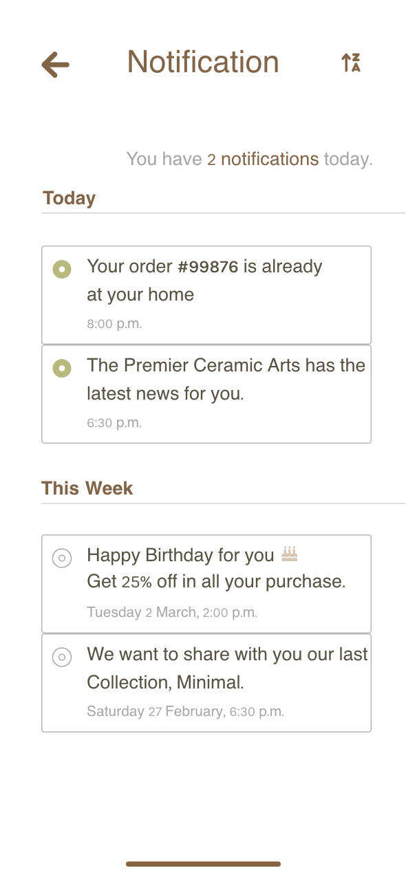
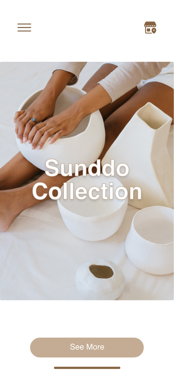
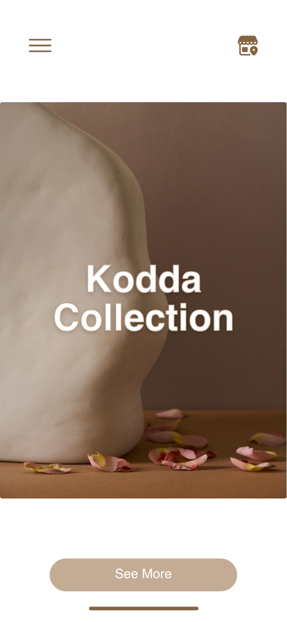
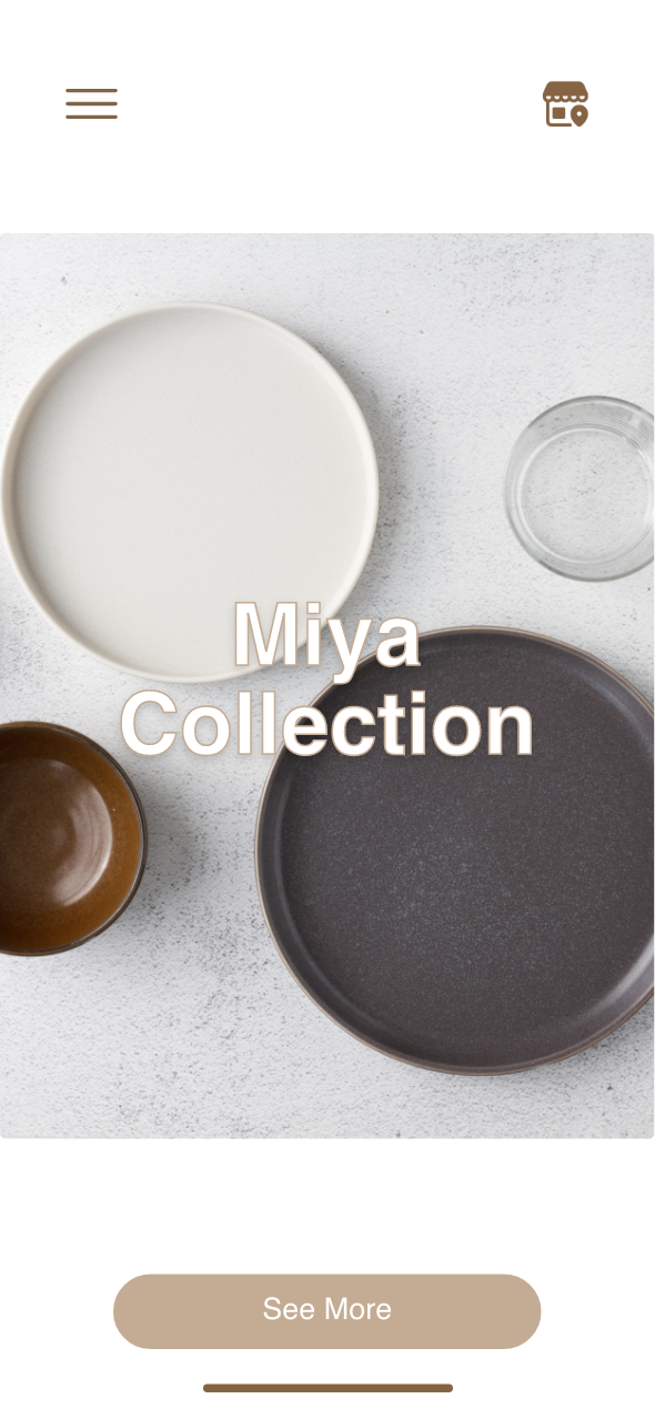
Here is the final result
As a realistic representation of the final design, showcasing the app's visual layout and user interface elements with precision. These wireframes include the style guide design, stunning images, and spacing, offering a clear vision of the user experience and interaction flow.
